Divvy Voronoi Diagram
Edit 2018-04-27: This isn’t currently working, likely because something changed with Divvy’s API. I’ll fix it when I get a chance.
Divvy is an great public bicycle service in Chicago - it’s relatively inexpensive, has stations all over town, and is helping to make the city an even better place to ride a bike. There are, however, a few big issues:
- The official station map is awful. It’s unusable at the default zoom level, presenting a wall of blue icons covering the entire city. Once you manually find your location it’s mostly fine, but the icons are still too large and there’s no easy way to determine which station is closest to you.
- The bikes aren’t that great either.
There isn’t much to be done about #2, but I took a shot at fixing #1.
Making a better map
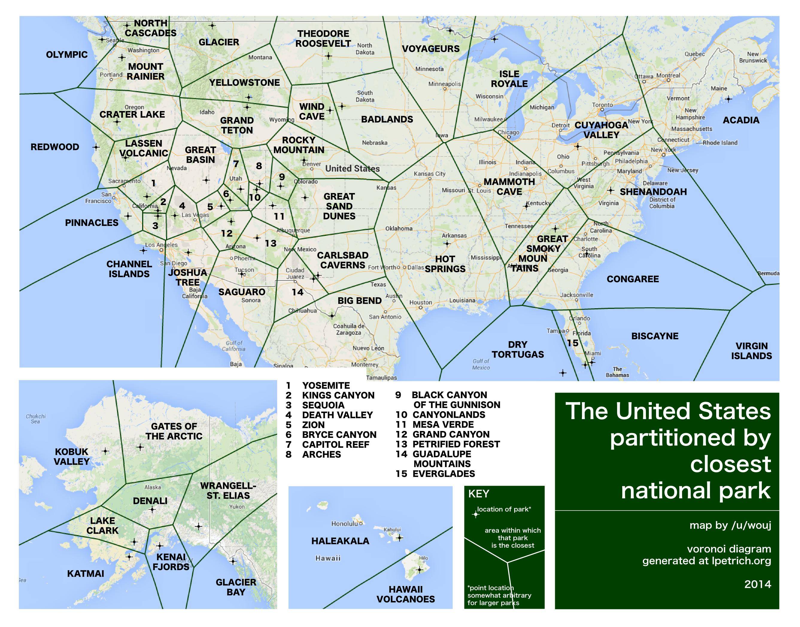
Voronoi diagrams are a good fit for this kind of application. They subdivide an area in such a way that each location is within the “territory” of the nearest point of interest. This neat National Parks map is a great example (and proof the Midwest needs a real Pawnee National Park):
I started with Google Maps as the base, and added the D3.js Voronoi API to generate the diagram layer. Thankfully Divvy is very data-friendly, and maintains a publicly accessible JSON feed with updated station data. After running into some cross-domain issues, I used YQL (the most useful thing Yahoo! has ever done) to grab the live feed. Finally, I added geolocation to refocus the map on startup and automatically find the closest station with bikes.
The prototype
Bookmarkable version here, source on GitHub here.
Future improvements
Even though it’s mostly functional, this is just a proof of concept so far. The code is a hack of about five different tutorials, and is in need of some TLC from a real web developer. In this implementation stations with no bikes/docks are excluded from the diagram, but it would be better still to apply lower weights to stations that are about to run out. Also, given that Chicago is basically a grid system, the Manhattan distance (currently unsupported in D3.js) would be more realistic than the Euclidean.
