LEEP Cost-Effectiveness Analysis
A silver lining for me in the otherwise dark cloud of 2020 appeared in mid-August, when Charity Entrepreneurship (CE) announced that lead paint regulation was among its “top charity ideas” for the year. More good news followed a few months later with the official launch of the Lead Exposure Elimination Project (LEEP), a new (CE-incubated) charity dedicated to reducing the global burden of lead poisoning.
As someone who has previously written on the prospect of lead as an EA cause area, I was thrilled to see this new interest, and my excitement was undiminished after meeting LEEP co-founders Lucia and Jack. In the months since their launch the duo has hit the ground running in Malawi, performing independent testing to confirm the (alarmingly high) lead content in local paint, and cultivating key government contacts to help initiate the regulation process. And all that during a global pandemic, on a shoestring budget, and from halfway across the world!
As part of a review of their cost-effectiveness analysis (CEA), they asked me to look over their existing calculations (which were derived from a more complex model developed by CE during their evaluation process). After a quick sanity check of the overall structure, I decided to focus on one particular area of the analysis, taking a deep dive into the section on health outcomes.
The full model used to generate the following plots is available as a Jupyter notebook here.
Population
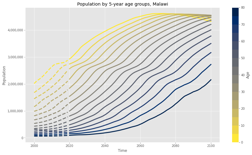
Any policy change in Malawi is still potentially years away, and because of the health dynamics of lead poisoning, even a successful intervention will mostly benefit future humans. And so it’s crucial for LEEP to have a good understanding of the changing population in any target country. While projecting even a few months into the future can be a nontrivial task, the UN maintains country-specific population forecasts through 2100(!?).
Even for a relatively deterministic metric like population growth, these estimates strike me as wildly optimistic (Toby Ord, for instance, thinks there’s a one in six chance that the overall human population in 2100 will be 0). However, worlds where the population deviates significantly from the UN’s projection are also probably ones where lead poisoning is, for whatever reason, no longer among our biggest problems. (Depending on your philosophical commitments, this may imply that you should prioritize work on existential risks like engineered pathogens and misaligned AI, but I’m ignoring this consideration for the purposes of the following analysis.) Regardless, I’ll use the median UN estimates as a “best guess” estimate for the future population in LEEP’s target country (here and below assumed to be Malawi).
In this and most of the following graphs, historical data is shown with “dashed” lines, and projected data with “solid” lines.
Given the conservative assumption that the intervention only affects future generations, population growth turns out to be a critical factor when projecting health outcomes. It may, for instance, be preferable to target a smaller country with faster population growth rather than a larger one with slower growth, especially when the effects of LEEP’s intervention will only be felt decades from now. As we’ll see below, certain assumptions about the interaction between population and paint market growth could make this estimate doubly important.
Also, breaking up the estimate into five-year age groups will allow us to account for age-specific disease burden (i.e. intellectual impairment for young childrean, heart disease for older adults).
Health outcomes
The second data set used in my analysis comes from IMHE’s Global Burden of Disease (GBD) tool. This mind-bogglingly expansive resource accounts for the negative health outcomes of hundreds of diseases, injuries, and risk factors across 200+ countries and over several decades. For the purposes of this analysis, I downloaded the the full data set associated with the “lead exposure” risk factor, divided by country and age group.
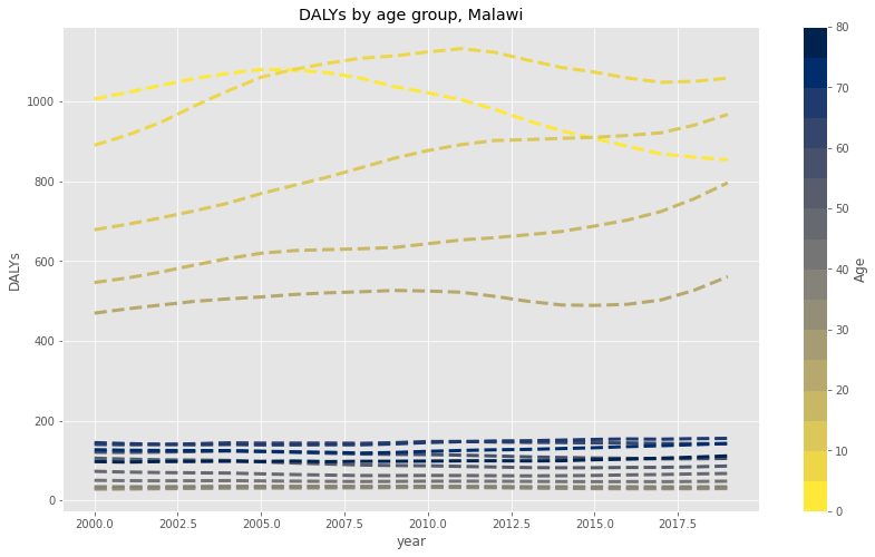
The GBD data includes absurdly precise estimates, reporting that, for instance, the total number of DALYs experienced by 60-64 year olds in Malawi due to rheumatic heart disease in 1991 was 10.156989. How they arrived at this particular and extremely specific number is probably very interesting, but for the purposes of this analysis, I’ll simply take their “middle” estimate as the given for each category. From 2000 to 2019, the totally DALY estimates for each five-year age group are as follows:
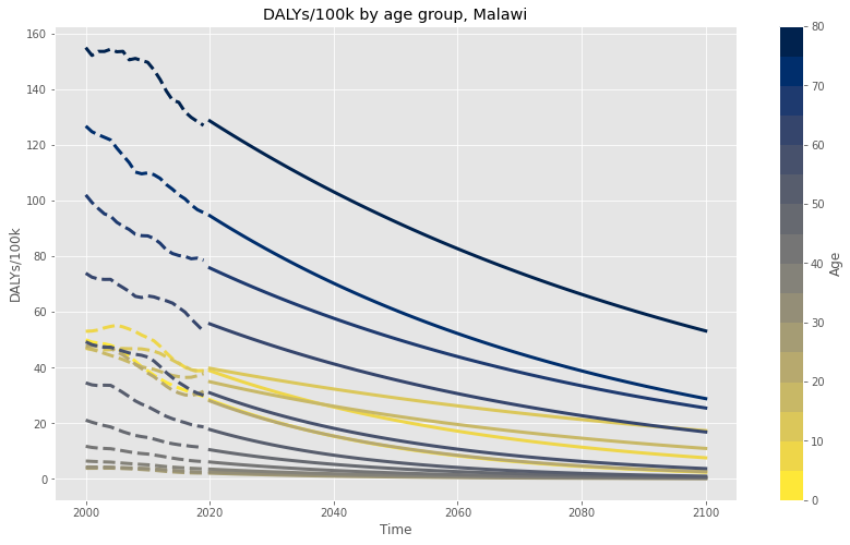
Although these numbers look relatively flat, the story is actually somewhat more optimistic when combined with Malawi’s population growth over the same time period. Dividing the total DALYs by the UN population numbers for each year, we can come up with a DALYs/100k estimate for each year and age group.
In the above graph, the dashed line represents the previous ~20 years of “known” DALY rates among the different age groups of Malawi’s population due to lead exposure. Based on the observation that these numbers appear to be decreasing (perhaps due to the lingering effects of the global ban on lead in gasoline?), and the conservative assumption that they will continue to decrease on their own (without actually reaching zero), I fit an exponential function to the DALY rates in each age group and projected through 2100.
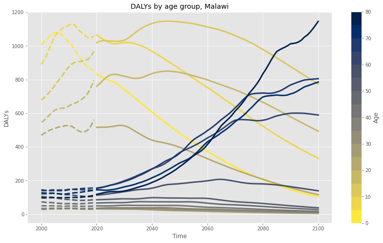
Using these projected DALY/100k rates, I then multiplied by the estimated future population to find the projected total burden of lead exposure in Malawi, by age group, through 2100:
One potentially counterintuitive observation is already apparent: following historical trends in developing countries, a larger percentage of Malawians will reach old age, and the percentage of total lead burden affecting the elderly will increase accordingly (as shown in the the darker blue lines above).
Creating cohorts
This brings us to the trickiest part of the analysis, and the one in which I have the most personal uncertainty. So far we’ve calculated the expected total burden of lead poisoning in Malawi through 2100. But the critical question remains: if LEEP is successful, and helps introduce lead paint regulations, what percentage of the total future lead burden will they have (counterfactually) helped to avert?
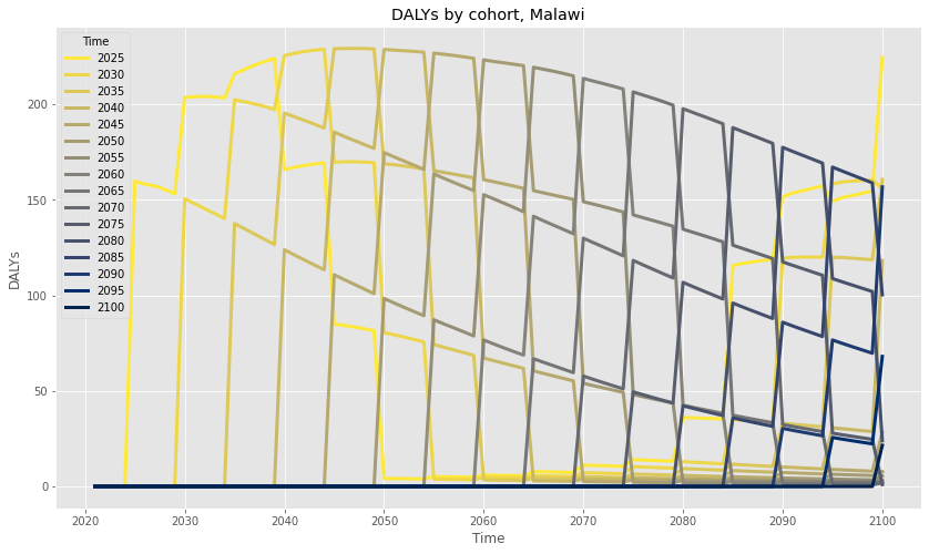
Because young children, with growing bodies and brains, are the most susceptible to the pernicious effects of lead exposure, any attempt to answer the above likely requires us to consider LEEP’s impact by birth cohort. Sorting in this way allows us to conservatively count only the DALYs associated with children who successfully avoid lead exposure in childhood as a result of LEEP’s intervention. And so I started by creating yearly cohorts using the total projected DALYs by age, shown below in five year increments.
To help read this graph, try tracing the yellow line of children born in 2025 as they age throughout the remainder of the century.
But how should we determine whether or not children born after the lead paint ban will actually avoid contact with lead paint? Viewed in some ways, this seems like a depressingly intractable problem. The exact answer could, for instance, depend on how often typical Malawians repaint their house, how often families with young children move to new houses, the pace of new home construction relative to the retirement of existing housing stock, and other hard-to-measure factors.
For the purposes of this analysis, I made the following assumptions:
- The expected total burden in the future population assumes the current baseline level of lead exposure.
- As population increases, with no intervention (from LEEP or otherwise), the rate of exposure will remain constant, even as the population grows.
- However, after lead paint regulation is introduced, no additional lead paint will enter the housing market.
- Any population growth after paint regulation will cause a corresponding increase in “unleaded” paint share on the housing market.
- Therefore, the amount of lead paint burden averted will be proportional to the future population relative to the population when the regulation was introduced.
To give a (hopefully) intuitive example: imagine a country with a current population of 100 people, and a corresponding total lead burden of 10 DALYs/year. If the population were to triple over a given period without a prior lead paint ban, then we could naively expect the total burden at the end of that period to be 30 DALYs/year, matching the increase in population.
However, if a lead paint regulation was introduced prior to that period of growth, then while the population would still increase to 300 people, the lead burden would remain fixed at 10 DALYs/year. Although all the new housing stock would be lead-free, the 100 people living in existing homes would still experience the original burden. As such, this intervention could claim credit for a counterfactual (30 - 10 =) 20 DALYs averted per year, or about 67% of the “expected” burden.
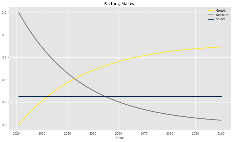
Using Malawi’s population growth, and under the most optimistic projection that LEEP successfully helps introduce paint regulations this year, the largest possible fraction of avertable DALYs that they can claim credit for is represented by the yellow “Growth” line on the chart below:
The other factors shown on the graph above are Discount, which visualizes the effect of the (apparently standard?) 4% discount rate (quantifying the intuition that, for various reasons, we care more about near-term benefits than long-term ones), and Source, which corrects for the fact that not all lead exposure comes from paint (the specific 25% number is a conservative assumption based on CE’s understanding of expert consensus).
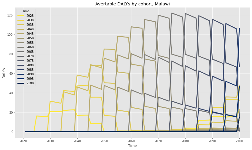
And so, the total factor by which any given cohort’s DALYs are avertable is equal to the product of these three factors, with Growth locked at their birth year (capturing the conservative assumption that the effects of lead are an immutable function of adolescent exposure). We can use this product to adjust the original cohorts graph as shown below:
Results
Edit 2021-06-03: In retrospect, I think I may be comparing apples and oranges with the CE/LEEP CEA comparisons in the graph below, due to varying model assumptions. I may come back to fix this later, but it doesn’t change my overall conclusions re: LEEP’s cost effectiveness.
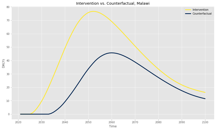
Finally, we’re in a position to calculate the health benefits of a successful LEEP intervention. To do this, we create a customized reduction factor, as described above, based on the estimated year of the intervention, multiply it by the total avertable DALYs by birth cohort, and sum for each year across living cohorts. Critically, both CE and LEEP also assume that, even without their intervention, lead paint would eventually be regulated by Malawi at some point in the near future (perhaps with the help of a similar organization like IPEN). In the graph shown below, I’ve calculated the expected DALYs averted per year for both LEEP and the counterfactual, keeping the CE/LEEP assumption that the intervention “moves up” the regulation timeline by eight years from 2033 to 2025:
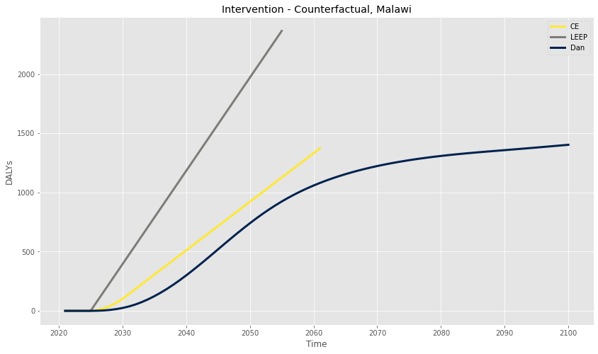
The total DALYs averted by the LEEP’s hypothetical 2025 success can be calculated by simply adding up the year-by-year difference between the Intervention and Counterfactual curves, and is plotted in dark blue on the graph below:
I’ve also included the CE and LEEP estimates on this graph. Overall, the final estimates are quite similar (i.e. well within a factor of two), which lends personal credence to the remainder of the CE/LEEP analyses.
Conclusion
In this post I took a deep dive into a small subsection of a CEA on the regulation of lead paint in Malawi, but the full CE/LEEP analyses don’t stop there. In addition to health outcomes, they both consider other detrimental effects of lead exposure on future earnings potential, as well as the costs (and likelihood of success) of any potential intervention. While I haven’t done an in-depth analysis on these other factors, I don’t see anything so far that would lead me to believe that they are systematically biased towards favorable assumptions.
I think I may have unearthed at least one interesting idea during my review, which is the importance of growth as a differentiating factor in country selection. Because both overall DALYs and the avertable fraction are dependent on population (in my model at least), countries with larger projected growth could be especially good choices. (Eg. a country with low population growth also builds fewer new houses, and therefore will take the longest to refresh their existing housing stock, leading to more future childhood lead exposure).
This was also a lot of fun, and I even learned a bit about a few useful data sets, as well as some interesting CEA “best practices.” In the future, I may consider updating this model in various ways, perhaps by including the additional factors from the CE/LEEP analyses, or converting the point estimates to probability distributions as part of a Monte Carlo approach.
As I reach this final paragraph, I now realize that I’ve probably buried the lede, which is that CE and LEEP’s analysis both show that lead paint regulation is a promising intervention, with conservative estimates that place it in the neighborhood of top GiveWell recommended charities. If you take one thing away from this post, it should be that lead poisoning remains a bad thing, and organizations like LEEP provide a potentially very cost-effective way to allocate your charitable dollars.
